Last Updated: March 30, 2026
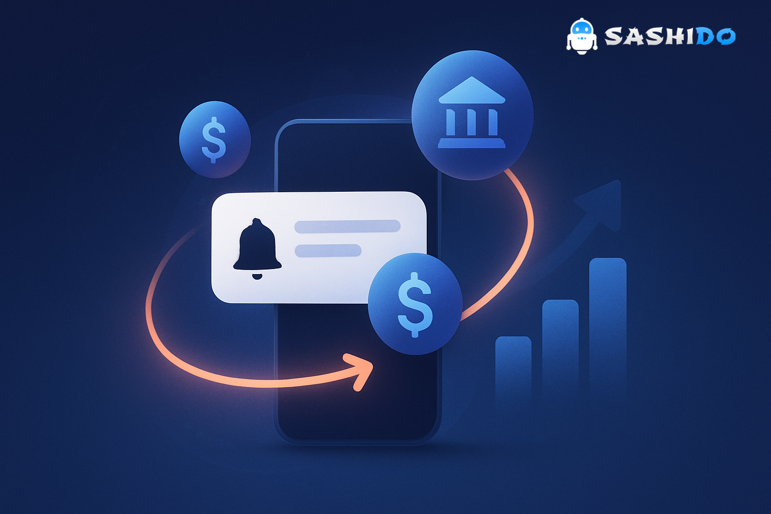
Mobile banking adoption is no longer the headline. The day-to-day expectation is that your app works like a branch that fits in a pocket, with instant confirmations, fast help, and security that feels proactive. That is why banking app push notifications tend to make or break trust faster than almost any other channel. When a payment clears, a card is used, or a secure message arrives, users want the update as a phone notification right when it matters. If they do not get it, they assume something is wrong, or they simply stop checking your app.
Usage patterns back this up. Sessions for banking and payment apps in the U.S. grew 27% from 2019 to 2020, which reinforced how much of the banking relationship shifted into mobile moments that need real-time customer messaging. You can see the data in Adjust’s Mobile Finance Report 2020. https://engage.apptopia.com/hubfs/Adjust%20Mobile%20Finance%20Report%202020/2020-09_Mobile-Finance-Report-2020.pdf
If you own lifecycle messaging for a banking product, you already feel the pressure from both sides. Growth wants reactivation and cross-sell. Risk and compliance want zero surprises. Support wants fewer tickets. Engineering wants fewer last-minute “can you ship a new push flow today” requests. The practical way through is to treat push as part of your notification systems layer, not as one-off blasts.
This guide keeps the proven five-use-case structure that shows up across high-performing banking apps, then turns it into repeatable patterns a Growth and Retention CRM Manager can implement in 1 to 2 weeks. You will get timing, segmentation cues, sample message templates, frequency caps, A/B test ideas, and privacy guardrails that fit regulated products.
Why banking push feels different from every other app category
In banking, push is rarely “nice to have.” It is often the fastest way to confirm money movement, reduce uncertainty, and trigger the next right action. That is why transactional and security pushes consistently outperform generic promotional pushes on intent. Users did not open a banking app to be entertained. They opened it to be certain.
This also means mistakes are expensive. A push that leaks sensitive info on a locked screen can become a compliance issue. A push that fires late can create a support surge. A push that fires too often can train users to disable notifications altogether, which kills your ability to recover accounts during fraud or time-sensitive events.
The good news is that the same constraints that make banking hard also make it measurable. When you design pushes around real user moments, you can track outcomes like reduced “where is my transfer” tickets, improved secure message response time, higher weekly active users, and lower churn in the first 30 days.
Use Case 1: Transactional updates
Transactional updates are the daily backbone of banking app push notifications. They succeed because they are pure utility. They reassure users that the app is watching, the bank is responsive, and money movement is visible without forcing a login.
In practice, the most important pattern is to send the push when the state changes, not when the request was initiated. Users do not care that they tapped “pay” at 9:01. They care that it cleared at 9:03, or that it failed at 9:03 with a clear next step.
A few high-signal moments that consistently reduce uncertainty are card-present purchases, cash withdrawals, incoming transfers, mobile deposit received, transfer completed, and payment declined. Declines and holds deserve extra attention because they are churn accelerators when users cannot quickly resolve them.
Message templates that work because they are specific and actionable.
Your tone should be calm and matter-of-fact. Keep it short. Avoid stuffing balances or full merchant names into the preview if you support lock-screen previews.
- Cleared payment: Payment approved. View details and receipt in the app.
- Incoming transfer: Money received. Tap to see which account it landed in.
- Declined transaction: Payment declined. Tap to verify details or use a different account.
Segmentation that makes these messages feel personal without creeping users out.
Start by segmenting on product context and delivery preference. A user who only uses debit needs a different default deep link than a user who manages multiple cards. Segment “new account in first 14 days” separately, because they will interpret every transaction push as a trust test.
Cadence and frequency caps.
Transactional updates are event-driven, so the “cap” is not a marketing limit. The cap is about bundling when events spike. If you see clusters like multiple small card transactions in a few minutes, consider grouping into a single summary push when it does not impact safety.
A/B tests you can run without rewriting your whole stack.
Test deep link destination first. Send half of users to the transaction detail screen and half to the activity feed. Measure support clicks, session starts, and subsequent actions like dispute initiation.
Send a live transactional test in 5 minutes to validate delivery and deep links.
This is also where a developer-first customer engagement platform API pays off. With an event-driven integration, you can standardize triggers like transaction_settled or transaction_failed, then let your CRM team iterate on copy, timing, and deep links without waiting on a new app release.
Use Case 2: Security alerts
Security alerts address the number-one concern users have with mobile banking. Fraud and account takeover fears are not abstract. They show up as sudden notification opt-outs, angry app store reviews, and support calls that spike after any incident.
The winning pattern is urgency plus clarity, then a single next step. If you overload a security alert with options, users freeze. If you under-specify it, they assume it is spam.
Keep the copy short, direct, and explicit about what to do next. Do not ask users to “reply” to a push. Instead, deep link them into a secure confirmation flow inside the app, or instruct them to call a known support path.
Message templates with the right urgency.
- Suspicious charge check: Unrecognized card activity? Review and confirm in the app now.
- New device sign-in: New sign-in detected. Tap to verify or secure your account.
- MFA or password reset: Security check required. Open the app to continue.
Segmentation and targeting that reduces false alarms.
Users who travel often, transact internationally, or have multiple authorized users will get more “suspicious” events. If you do not segment these cohorts, you will create alert fatigue. Use risk signals from your fraud stack to decide when to use a push, when to require step-up authentication, and when to show in-app messaging only after login.
A/B tests that improve action rates.
Test CTA wording and destination. For example, “Review now” versus “Secure account.” Measure time-to-confirm, confirmed fraud rate, and downstream support contact rate.
Privacy and regulatory guardrails.
Avoid including detailed merchant or location info in lock-screen previews. Keep content minimal until the user authenticates. On the compliance side, align your approach with industry security expectations like the FFIEC guidance on authentication and access controls. https://www.ffiec.gov/news/press-releases/2021/pr-08-11
Also make sure your broader security program and vendor controls align with requirements like the FTC Safeguards Rule, especially when notifications touch customer information. https://www.ftc.gov/business-guidance/resources/ftc-safeguards-rule-what-your-business-needs-know
Use Case 3: Major account updates
Major account updates sit between transactional and marketing. They are not “real-time fraud.” They are the moments that keep customers routinely monitoring their finances, which is one of the simplest ways to lift retention. When users build the habit of opening statements, checking term deposits, and reviewing loan or card summaries, your app becomes the default financial control center.
This is where scheduled, predictable cadence wins. Users do not mind a monthly statement reminder. They mind randomness. If your push arrives at different times each month, it feels like marketing. If it arrives on a consistent schedule, it feels like service.
High-impact moments to cover.
Statement ready, card expiring in 30 days, new account opened, loan payment due soon, investment statement available, term deposit maturity approaching. The goal is not to “get a click.” The goal is to prevent users from drifting because they are not seeing the value of the app.
Message templates that drive quick action.
- Statement ready: Your monthly statement is ready. Tap to review in the app.
- Card expiring: Card expires soon. Update delivery details to avoid disruption.
- New account opened: Account opened successfully. Set up alerts to stay in control.
Segmentation that makes timing feel helpful.
Segment by product ownership and lifecycle stage. Credit-card-only users care about statement, due date, and credit utilization nudges. Deposit-only users care about balance thresholds and direct deposit confirmations. New users need fewer statement reminders and more “here’s what to do next” prompts.
Cadence and frequency caps.
Aim for a stable baseline like monthly statement reminders and weekly balance-check prompts only for users who opt in. If you are running a mobile campaign around major updates, keep a simple cap such as one scheduled “account update” push per week, excluding transactional and security events.
A/B tests that matter to retention.
Test reminder lead time. For expiring cards, compare 30 days versus 21 days versus 14 days. Measure completion rate of card reissue flows, support tickets about card disruption, and subsequent active days.
Use Case 4: Bank communications
If you want your app to mirror a branch experience, users need to feel that help is available without constantly checking the app. Secure messaging is common in banking apps, but real-time responsiveness is the differentiator. Push is what closes the loop.
The simplest pattern is to notify users when a secure message arrives and when a scheduled call is coming up. These are small prompts that prevent stalled conversations, missed appointment times, and repeated follow-ups that frustrate both sides.
What to send and when.
Notify on secure message received. Remind 10 minutes before a video call or banker appointment. If you offer 24/7 support, send a follow-up only when there is a response waiting, not as a generic “we are here” message.
Message templates that feel service-first.
- Secure message: You have a new secure message. Tap to reply when ready.
- Appointment reminder: Your banking call starts soon. Open the app to join.
- Support update: We have an update on your request. Tap to view securely.
Segmentation to reduce interruption.
Respect do-not-disturb patterns and local time zones. Segment users who routinely respond quickly versus those who prefer email. If a user consistently ignores communication pushes but replies to email, your push should downgrade to a silent badge update or an in-app inbox indicator.
KPI impact you can track.
Measure time-to-first-response and conversation resolution time. For many teams, improving response time reduces inbound phone calls and decreases churn that comes from “my bank never gets back to me.”
Use Case 5: Financial planning, support, and investment tips
This is where banking push shifts from reactive to proactive. Educational tips and support content help users feel more competent with money, which tends to increase product stickiness. The trap is turning this into generic content marketing. In a banking app, relevance is everything.
The pattern that works is to tie content to a clear moment. A user just set up a savings goal. A user linked a new account. A user completed onboarding last week. These are natural points to send short, useful guidance that helps them get value from features they already have.
Examples that connect to real moments.
After a user’s first mobile deposit, send a tip on deposit limits and hold times, then link to support content. After a user starts a new investment account, send a short primer on risk tolerance and diversification, then deep link to the educational hub. After onboarding, send a two-step sequence on enabling security alerts and setting balance thresholds.
Message templates that invite learning without sounding salesy.
- New saver: Want to make saving easier? See 3 ways to automate it in the app.
- New investor: Getting started with investing? Review the basics before your first trade.
- Support milestone: New here? Learn where to find statements and set alerts in 2 minutes.
Cadence and frequency caps.
Financial tips should be paced. A safe starting point is 1 value-add tip per week for opted-in users, plus an onboarding sequence capped at 2 pushes per week for the first two weeks. If you see opt-outs rise, slow down before you rewrite everything.
Privacy guardrails for educational pushes.
Be careful with personal data and personalization. Even if you have the data, you do not need to echo it in the push preview. Use segmentation behind the scenes, then keep the message generic enough that it is safe on a lock screen.
For a practical baseline on handling PII, NIST SP 800-122 is a widely referenced guide for protecting the confidentiality of personally identifiable information. https://csrc.nist.gov/pubs/sp/800/122/final
The measurement and operations layer: what to standardize first
If you want these five use cases to drive retention instead of becoming noise, standardize three things before you scale.
First, standardize event naming and payload discipline. Transaction, security, and account-update triggers should come from authoritative systems, not from client-side guesses. This reduces duplicates and late pushes.
Second, standardize frequency rules by category. Users tolerate high volume for transactional and security events, but they do not tolerate high volume for education and bank communications. Keeping categories separate prevents your “marketing cap” from accidentally suppressing a fraud alert.
Third, standardize the KPI mapping per use case so your reporting stays simple. Transactional updates should map to reduced support contacts and higher DAU. Security alerts should map to time-to-confirm and reduced fraud losses where measurable. Major updates should map to statement open rate and repeat sessions. Bank communications should map to response time. Financial tips should map to feature adoption and longer-term retention.
A practical checklist you can reuse during QA.
- Does the push contain sensitive financial details that could show on a lock screen.
- Is the deep link correct for each platform and app version.
- Can the user complete the next step in 1 to 2 taps.
- Are transactional and security events excluded from marketing frequency caps.
- Is there a safe fallback when deep linking fails.
Launching faster without engineering bottlenecks
Most CRM teams do not struggle with ideas. They struggle with deployment friction. You want to run A/B tests, tune segmentation, and coordinate a mobile campaign calendar, but you do not want to open a new engineering ticket every time you adjust copy or create a new audience.
That is the advantage of a developer-first platform that still gives lifecycle teams control. With a strong customer engagement platform API, your developers instrument events once and keep data ownership clear. Then your CRM team can build and iterate across the five banking app push notifications use cases without rebuilding notification systems every quarter.
If you are looking for that balance, using SashiDo - Push Notification Platform makes it easier to ship event-driven transactional and security pushes, then layer in segmentation, personalization, and testing for major account updates, bank communications, and educational tips.
You can also use SashiDo - Push Notification Platform to keep delivery and performance under control as volume grows, which matters when your “quiet day” suddenly turns into a fraud spike and you need the system to behave predictably.
Conclusion: make banking app push notifications feel like service
The five-use-case structure works because it mirrors how users actually experience banking in real life. Money moves. Risk needs attention. Accounts change. Conversations happen. People look for guidance. When you map banking app push notifications to those moments, you create a system that improves trust and customer experience technology outcomes at the same time.
Start with transactional updates and security alerts, because they set the trust baseline. Then use major account updates and bank communications to reduce drift. Finally, use financial planning and support tips to build habits and long-term value, without turning your push channel into noise.
Ready to scale secure, developer-first push for your banking app? Start with SashiDo - Push Notification Platform to launch campaigns without infra, target smarter with advanced segmentation, and keep full control of your data.