Push is still one of the fastest levers a growth team can pull. But the lock screen is a brutal place to compete, especially when every brand is pushing similar offers, reminders, and nudges.
In practice, emojis are one of the few elements that can change how a message feels without adding characters. Used well, they act like a visual subject line. Used poorly, they read as spam, render inconsistently across devices, or send the wrong tone to the wrong segment.
For a growth or performance marketer, the goal is not to make push “cuter”. The goal is to use emojis as a controlled variable inside a rigorous experiment loop that improves CTR, downstream conversion, and retention. This is where your push notification platform either helps you move fast, or quietly slows you down.
The real job emojis do on a crowded lock screen
Most push copy is skimmed, not read. The user sees a title, maybe part of the body, an app icon, and a timestamp. Emojis can change that first half-second in three common situations.
First, emojis create a visual anchor that breaks the line of similar looking notifications. A single ✅ or ⏰ can be easier to register than an adjective like “confirmed” or “urgent”.
Second, emojis compress tone. If your brand voice is friendly but your copy is short, a well-chosen emoji can signal intent faster than words, which matters when truncation happens on smaller devices.
Third, emojis can help segment meaning. When you run multiple lifecycle streams at once, small icons help the user mentally categorize messages, for example reminders vs. deals vs. updates.
A useful mental model is to treat an emoji like you would treat a subject line prefix in email. It should clarify the message, not replace it.
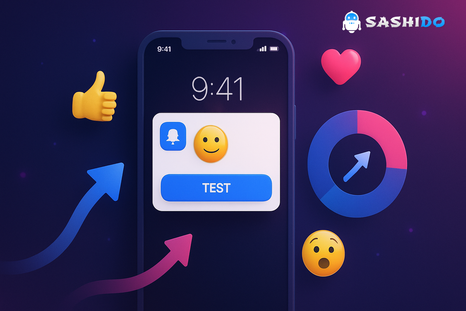
If you are running emoji experiments weekly, SashiDo - Push Notification Platform makes it easier to ship A/B/n variants and target clean segments without rebuilding your push workflow.
What the data says: typical lifts, and why variance is the point
Emoji performance is measurable, but it is not universal. The same emoji can lift CTR in one industry and drag it down in another, and the same “good” emoji can get tired when every competitor uses it.
A Forbes Tech Council write-up summarized multiple tests where emojis materially improved outcomes. It cites an 85% open-rate lift when emojis are included, and a Day 2 retention lift on Android in the U.S. from 25% to 32% in one observed case. Treat those numbers as signals, not promises. They tell you the lever is real. They do not tell you it will work for your audience without testing. Source: https://www.forbes.com/sites/forbestechcouncil/2017/04/03/how-to-improve-push-notifications-using-emojis/
At larger scale, a push dataset analysis of more than 4 billion notifications found an overall CTR pattern worth paying attention to. Average CTR without emoji was 2.74%. Average CTR with emoji was 3.44%. That is a 38% relative lift on CTR when emojis were used. Source: https://clevertap.com/blog/emojis-in-push-notifications/
The practical takeaway is that emojis are not “flair”. They are a lever that can change engagement. The equally practical takeaway is that you should expect wide variance by segment, context, and industry, which is why a test-ready push notification delivery platform matters.
Benchmarks by industry: where emojis often help, and where they can hurt
In the same 4B push analysis, some verticals saw dramatic improvements when emojis were present, while others saw declines.
Business and finance showed a large lift in CTR with emoji use. Utilities and services also saw a big lift. Retail improved sharply too. Meanwhile, entertainment and events dropped significantly, and travel and hospitality dropped as well, despite emojis “feeling” like a natural fit.
This is exactly the pattern growth teams run into in the wild. In “trust-heavy” moments like finance alerts, the user may see an emoji as clarity, like ✅ for success or ⛔ for a blocked action. In entertainment, where everyone already uses playful tone, emojis can become noise.
So instead of asking “should we use emojis”, ask a more testable question.
Which emoji categories lift CTR for which segments, and in which lifecycle moments, without harming conversion or opt-in rates?
Best performers, popular risks, and consistent underperformers
Another useful benchmark from large-scale push data is how specific emojis cluster.
Some emojis tend to perform well while also being widely understood, like 👍, ✅, and ⛔. Some are popular but can be less reliable, like 😍 or 💰. Some commonly underperform in push context, like 🎁, 🎶, or 🎉.
This does not mean 🎉 is “bad”. It means 🎉 is easy to overuse, and overuse is what kills it. The move is to treat emojis as assets with a lifecycle. They have a novelty phase, a plateau, and a fatigue phase.
How to pick emojis that match intent, not vibes
The teams that get consistent lift do one thing differently. They start from the message job, then choose the emoji.
If your message is urgency, ⏰ and ⚡ usually read as urgency. If your message is confirmation or success, ✅ often reads more clearly than celebratory emojis. If your message is a warning, ⛔ or ⚠️ is usually clearer than an angry face.
Where people go wrong is picking emojis based on what they personally like. That is how you end up with a finance alert that looks unserious, or a compliance message that feels sarcastic.
A good rule for performance campaigns is one emoji that signals category, then the copy does the persuasion. In other words, the emoji helps the user triage the notification. Your copy does the conversion work.
Personalization is where emojis stop being decoration
Emoji strategy gets much more powerful when it follows behavior, not demographics.
If someone repeatedly browses running shoes, a drop alert with 👟 can feel like a direct continuation of their intent. If someone saves items and abandons, a gentle reminder with ⏰ can feel like timing, not pressure. If someone hits a milestone, a subtle ✅ can feel like progress without being childish.
The same message with the same emoji will not land the same way for an active buyer vs. a lapsed user. Your segmentation should control this.
This is a sweet spot for a real-time push notification service because you can select users based on recent events, not last month’s cohort labels. When you can trigger on “viewed product three times in 24 hours” or “failed payment”, emoji usage becomes part of relevance.
The A/B/n testing setup that actually answers the question
Most emoji tests fail because they test too many things at once. The copy changes, the offer changes, the emoji changes, the segment changes, and the send time changes. Then everyone argues about the winner.
For clean learning, keep the experiment narrow.
A practical A/B/n structure for emoji experiments
If your baseline push is text-only, a strong first test is:
- Variant A: no emoji
- Variant B: one emoji at the start of the title
- Variant C: one emoji at the end of the title
- Variant D: one emoji that signals a different intent category
That is enough to isolate placement and category without exploding complexity.
Then run the same structure in two segments that matter to ROI, such as active purchasers vs. reactivation targets. You will often find placement helps one segment and hurts the other.
Metrics that matter beyond CTR
CTR is the fastest read, but it can be misleading. Some emojis increase taps because they look like a “deal”, then reduce conversion because the landing is not aligned.
In mid-market growth teams, the cleanest approach is to track:
First, delivered rate and displayed rate where possible, because rendering and OS behavior can change visibility.
Second, open and click-through, because that tells you attention capture.
Third, a downstream action that matches the campaign, like add-to-cart, purchase, subscription renewal, or content watch-time.
Fourth, opt-out rate and notification disable rate, because emoji fatigue shows up here before it shows up in CTR.
If your measurement is fragmented across channels, keep the push test scoped to a single conversion event that your analytics can reliably attribute. You can expand later.
Ready-to-run message variants you can adapt quickly
These are intentionally generic patterns you can plug into your own offers and events.
Urgency offer
A: “Your cart is waiting. Checkout today.”
B: “⏰ Your cart is waiting. Checkout today.”
C: “Your cart is waiting. Checkout today ⏰”
D: “✅ Cart saved. Checkout when you’re ready.”
Notice how D changes the emotion. It is less pushy. In many segments, it converts better even if CTR drops.
Progress or completion
A: “Your verification is complete.”
B: “✅ Your verification is complete.”
C: “Your verification is complete ✅”
D: “📣 Update. Your verification is complete.”
Price drop or deal
A: “Price dropped on items you viewed.”
B: “💰 Price dropped on items you viewed.”
C: “Price dropped on items you viewed 💰”
D: “⬇️ Price dropped on items you viewed.”
Here, 💰 is tempting but can over-promise. ⬇️ often reads more “informational” than “salesy”. That distinction matters in regulated categories.
Send-time discipline: do not “gift” emojis to a better time
A common trap is to run the emoji test at the same time you implement best-time-to-send. Then your emoji winner is really a send-time winner.
If you are also optimizing send time, keep it constant during the first emoji experiment, or run a factorial design only if you have volume.
It is worth noting that send-time optimization alone can move CTR meaningfully. One case study describes a 60% CTR increase by adjusting send time based on engagement patterns. Source: https://clevertap.com/case-study/how-using-best-time-to-send-lifted-zee5-global-campaign-ctrs-by-60/
Rendering and compatibility: the part that breaks “winning” emojis
If you have ever rolled out a winning emoji variant and then seen it underperform in one OS slice, you have probably hit rendering or truncation.
Emojis are standardized, but glyphs are not
Unicode defines emoji code points and sequences. Platforms decide how they look. That is why the same emoji can appear friendly on one device and uncanny on another. Unicode’s emoji charts are a good reminder that standardization is about encoding, not aesthetics. Source: https://unicode.org/emoji/charts/
In performance terms, you should assume two things.
First, certain emojis can render as text-like glyphs or boxes on older devices, which makes your message look broken.
Second, combined emojis and skin tone modifiers can expand character counts in ways that impact truncation.
The lock-screen preview problem
What matters is not how your message looks in your campaign builder. It is how it looks on lock screens, notification trays, and web push permission contexts.
The practical workflow is to validate:
- Title length with and without emoji, because the emoji can push critical words out of view.
- Emoji placement, because an emoji at the start is more likely to survive truncation.
- Android vs. iOS line breaks, because the same body text can show different cutoffs.
If you are running cross-platform push notifications across iOS, Android, and web, treat previewing as part of QA, not as an optional step.
The biggest pitfalls, and how to avoid them before they hit ROI
Emoji mistakes are rarely “creative” mistakes. They are segmentation and context mistakes.
Cultural meaning shifts faster than brand guidelines
Emojis are not a universal language. Meaning changes by region, age group, and platform culture. Even within the same language, 🙏 can read as “thanks” in some markets and as prayer in others.
If you are sending globally, the fix is not to ban emojis. The fix is to localize the emoji set the same way you localize copy. Start with the most universally understood emojis, then expand based on regional response.
Research on emoji interpretation and prediction highlights why context matters and why meaning is ambiguous without it. Source: https://pure.uva.nl/ws/files/32358375/Emoji_Challenges_in_Prediction.pdf
Emoji fatigue shows up as opt-outs, not just lower CTR
If you add emojis everywhere, performance may rise for a week, then slowly slide. The slide is easy to miss if you only look at CTR.
Watch your notification disable rate, your opt-out rate, and your long-term retention. When emojis are overused, the message stream starts to feel less trustworthy, especially for mid-market brands that are trying to look established.
A simple operational fix is to set an internal rule that only certain campaign types can use emojis, and to rotate emoji sets quarterly based on performance.
Off-brand tone is usually a lifecycle mismatch
Most “off-brand” reactions happen because an emoji is paired with the wrong message type.
Playful emojis can work for a promotion. They often fail for transactional updates like claims, cancellations, refunds, and account security.
If you need one place to start, define a small approved set.
- Confirmations: ✅ 👍
- Urgency: ⏰ ⚡
- Warnings or blocks: ⛔ ⚠️
- Announcements: 📣
This does not replace testing. It just keeps you out of the obvious traps.
Where your push notification platform makes or breaks emoji performance
If you are serious about emojis as a performance lever, you quickly run into operational needs. You need fast A/B/n setup, clean segmentation, reliable delivery, and the ability to target in real time without asking engineering for new pipelines every sprint.
This is the difference between a tool that is “fine for sending pushes” and a scalable push notification service that supports growth iteration.
What to look for as a growth team in a push notification delivery platform
You want experimentation speed without losing control.
You want a push notification API your engineers do not hate, because emoji tests still require event triggers, templates, and consistent payloads.
You want cross-platform push notifications that behave predictably across iOS, Android, and web, because your “winner” is only a winner if it renders correctly and arrives consistently.
And you want segmentation that reflects live behavior, so emoji personalization is not guesswork.
In practice, this is where SashiDo - Push Notification Platform fits well for teams that need developer-first control and enterprise-grade delivery. It is built to help you launch faster, target smarter, and scale securely without building or maintaining notification infrastructure.
If you are evaluating an OneSignal alternative
Many teams start with OneSignal because it is easy to get going. The moment you need deeper control over data flows, real-time triggers, and how your segmentation maps to your product analytics, you usually start looking for an OneSignal alternative that is more developer-first.
If that is your situation, compare capabilities and trade-offs directly here: https://www.sashido.io/en/sashido-vs-onesignal
A simple operating checklist for emoji push campaigns
If your team wants to treat emojis as a measurable channel lever, not a creative experiment, run this loop.
First, decide the job of the notification. Promotion, reminder, progress, alert, announcement.
Second, select one emoji category that reinforces that job, not one that decorates it.
Third, test placement and category with an A/B/n structure that keeps everything else constant.
Fourth, validate rendering across iOS and Android slices, and check truncation on smaller screens.
Fifth, read results beyond CTR, including conversions and opt-out signals.
Sixth, rotate emoji sets to avoid fatigue, and localize emoji meaning for key regions.
Conclusion: treat emojis like performance assets inside your push notification platform
Emojis can lift opens, CTR, and even retention when they clarify intent and match context. They can also backfire when they create tone mismatch, fatigue, or rendering problems. The difference is rarely luck. It is segmentation, testing discipline, and operational speed.
If you want emojis to be a repeatable growth lever, build your process around fast iteration and reliable delivery. That is ultimately a push notification platform decision, not just a copywriting decision.
When you are ready to run emoji A/B/n tests, segment by real-time behavior, and ship reliable cross-platform push notifications without extra infrastructure, SashiDo - Push Notification Platform is the fastest place to start. You can start a free trial or request a demo to scale personalization with full control over delivery and data.